Project Description
Our friends at Kanon Electric needed a logo update but wanted to keep their current concept including the color palette. We were excited to help. We updated the typestyle – making it stronger and more pronounced so the images would not compete with the company name. And, we stylized the cross and made it bigger so that it was easily recognizable.
Alternate logo and icon we designed for less formal situations and purposes.
Horizontal Lightning Logo
Lightning Logo
Lightning Icon
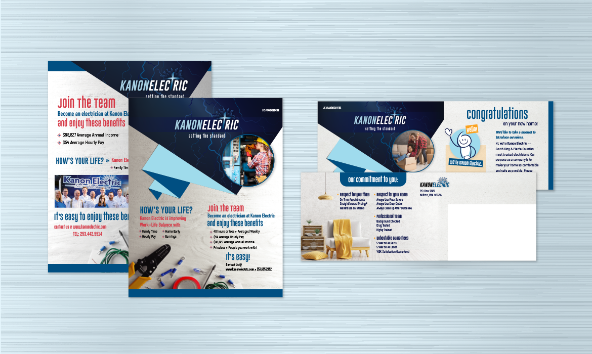
Additional Projects for Kanon Electric include postcards, flyers, posters, ads and vehicle wraps.


